Atelier Manferdini's InVisible wraps a Crystal City substation in metal and coloured tile, turning utility infrastructure into a neighbourhood design statement.
 Substations are usually the least considered buildings in any city. They're fenced, functional and built to be ignored. So when Atelier Manferdini, a studio based in California, puts an expressive facade on one, it's worth paying attention to what it's trying to say.
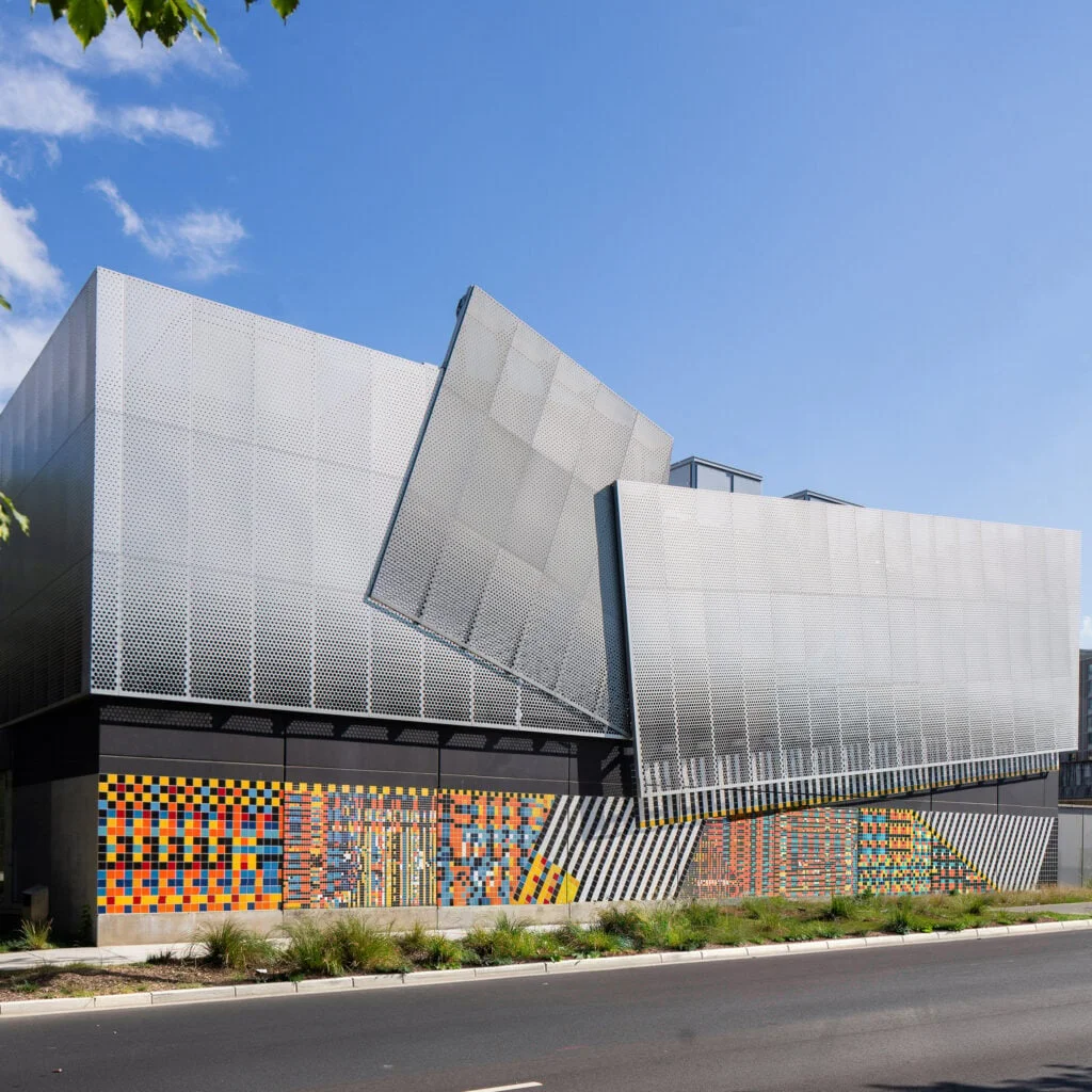
The studio's project, called InVisible, wraps an electrical substation in Virginia in metal and coloured tile. The design is meant to represent the flow of electrical power moving through the building. It's a clever idea, and it's a bold one for a piece of utility infrastructure whose job is mostly to stay out of sight.
 The client was Dominion Energy, an electricity provider. The company was upgrading the substation in Crystal City, in Northern Virginia, a short distance outside Washington DC. That's the detail that matters most. This isn't a showcase commission on a greenfield site. It's a working piece of grid infrastructure in a dense, highly visible part of the region, and the facade is part of the upgrade rather than an afterthought bolted on later.
Here's the thing: utilities rarely commission architecture for its own sake, so the decision to invest in expression here is notable. Whether it signals a broader shift in how power companies think about their buildings, or simply a one-off willingness from this client, isn't clear from the project alone. One substation doesn't make a trend, and the project doesn't tell us what the upgrade cost or whether similar facades are planned elsewhere.
Most substations are built to be ignored. Fences, gravel, a transformer humming behind a wall: nobody's supposed to linger. Atelier Manferdini's inVisible bets on the opposite, that grid infrastructure can earn its place in a neighbourhood by addressing people rather than machines. Founder Elena Manferdini, who is Italian and teaches at Sci-Arc in Los Angeles, says the studio set out to turn a largely functional structure into something more human.
Two audiences, one building
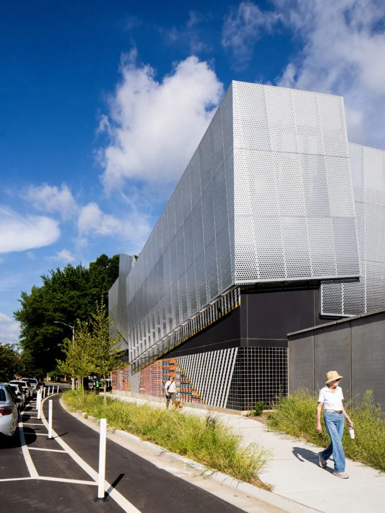
Manferdini's diagnosis is blunt. "Critical infrastructure is essential to our cities, yet the Dominion Energy substation is fundamentally designed for machines rather than people," she said. Most of the building's interior will never be seen by anyone except maintenance crews, and that's the point she's pushing against. The design splits the substation into two conversations. Inside, the layout serves equipment. Outside, the studio wanted something that could speak to the street.
"With inVisible, we wanted to explore this dichotomy, transforming a purely functional structure into something meaningful to the surrounding community," she explained. The exterior, in her words, becomes "an opportunity to engage with people through color, pattern, and perception, creating a dialogue between infrastructure and the human scale of the city."
Patterns that encode the grid
The substation's job is to convert power into different voltages so it can be carried across the network. The studio built that process into the facade. The patterns on the sculptural exterior were computationally designed to represent the conversion, so the decoration is less ornament than diagram.
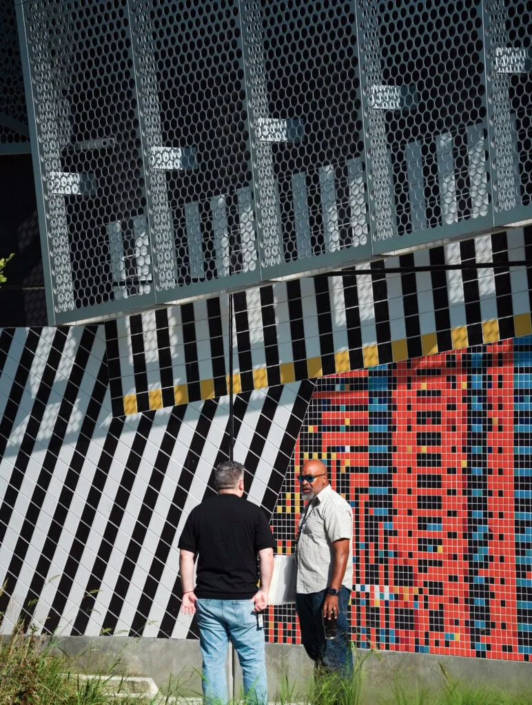
The tool behind it was Processing, the programming environment that emerged from the MIT Media Lab in the early 2000s. The studio used it to draw the colourful tile band running along the base of the structure. The band uses 10 colours and tiles in three sizes, two, four, and six inches across, each size a nod to a voltage level. The program also includes deliberate "glitches" that break up the grid and give the graphic its irregular energy. Those glitches are the most interesting choice here. A purely systematic pattern would read as a spec sheet. The disruptions make it look like something alive is running underneath.
The composition recalls the Boogie Woogie works of modernist artist Piet Mondrian, which were grounded in the rhythms of cities. It's a smart reference. Mondrian's grids were never really about stillness, and a substation that borrows his rhythm is claiming the city's pulse as its own.
Metal above, light after dark
Above the ceramic band, the studio placed massive gridded aluminium panels. They form a ventilated facade, set at different distances from the exterior walls and stacked where they meet. Sunlight passes through the grid at varying densities, so the surface never looks the same twice. "The folds catch light and cast shadows, allowing the surface to shift with the time of day and the viewer's position," the studio said.
The effect changes again at night. Programmable LEDs backlight the panels, turning the metal into a lit screen. The design depends on that shift between day and night, and it's where the project feels most ambitious. Whether it works in practice will depend on how the lighting is programmed and how the panels weather over time. Neither is something a rendering can prove.
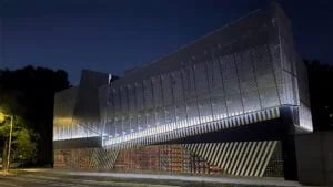
The studio sees the two halves as a single image. "Quiet and metallic above, saturated and granular below, the two bands form a unified architectural composition," it said, with the machinery humming away inside. That contrast is the whole argument in one sentence. The metal calms the eye, the tiles agitate it, and the building holds both.
Where this fits
inVisible is part of a broader shift in how designers treat infrastructure. Schmidt Hammer Lassen wrapped a power station in China in steel lamellas and topped it with a walkway, and the studio's approach there showed how much a utility building can carry when it's given room to be seen. GH3, a Canadian studio known for its sculptural stormwater facility in Toronto, has built a reputation for giving overlooked infrastructure an aesthetic life.
Here's the thing: the aesthetic treatment is the easy part to admire. The harder question is whether a facade that talks to the street changes how people actually use or feel about the place. Manferdini's pattern is clever, and the link between tile sizes and voltage is the kind of detail that rewards a closer look. But the strongest version of this idea would make the substation's function legible to the people walking past it. If you're working on public infrastructure, that's the standard worth holding this project to.
Discussion
Sign in to join the discussion.